OFFICER RECRUITMENT
Clarity in a Complicated Process
How I helped transform officer recruitment from chaos into a transparent digital journey.
In the first week of launch:
officer candidates applied.
Lead UI/UX Designer
7 Developers
1 QA
1 Product Owner
1 Project Manager
1 UI/UX Designer
August 2024 - April 2025
Mobile App


Overview
This project was about modernizing the recruitment process for officer-level candidates in a U.S. government agency. The existing system relied heavily on manual tasks, making it inefficient for recruiters and confusing for applicants.
As the Lead UI/UX Designer, I was responsible for designing a digital portal that:
-
Reduced repetitive tasks for recruiters
-
Gave applicants visibility into their journey
-
Scaled as a foundation for future improvements
The result was a web application that simplified workflows on both sides and achieved measurable impact from day one.
PROCESS
When Confusion Costs Candidates
Before this project, the recruitment process was painfully outdated. Recruiters were buried in spreadsheets, follow-up emails, and phone calls. Applicants were equally frustrated; they couldn’t see where they stood, what came next, or how long it might take.
The system wasn’t just inefficient. It was discouraging.
And in recruitment, discouragement meant losing strong candidates.
Sitting With Recruiters, Not Just the Data
I began by flying to the San Antonio Air Force Base to meet recruiters in person.
I asked them about:
-
How they track and filter applicants
-
Which questions really matter in screening
-
Where the process stalls the most
-
What applicants ask them again and again
One recruiter summed it up perfectly:
“We spend more time following up than recruiting.”
From these conversations, I created a user flow mapping the applicant journey end-to-end. It exposed every friction point and gave us a roadmap for design.


Designing for Clarity, Efficiency, and Scale
From the start, I set three design principles with the team:

Clarity over ambiguity → Applicants should always know where they stand.

Automation over repetition → Recruiters shouldn’t answer the same question 20 times.

Scalable foundation → Build an MVP that could grow with future needs.
These principles guided every design decision, from sketches to final prototypes.
IMPLEMENTATION
Design, Dev, and Product — in Lockstep

We worked in a Kanban Agile framework with daily standups and shifting priorities.
- With developers, I held quick walkthroughs before shipping to ensure details like empty states and color usage were handled correctly.
- With our Product Owner, I shaped the design strategy and aligned features with recruiter needs.
- With recruiters, I shared weekly iterations and gathered direct feedback.
That tight loop kept the team aligned and the product evolving smoothly.
Transforming Constraints Into Clarity
One of the biggest constraints was integrating with AFRISS (Air Force Recruiting Information Support System) — the official database recruiters use to track candidates.
AFRISS is powerful on the backend, but limited in what it shares. It only provides a handful of predefined statuses, which made it difficult to give applicants meaningful updates.
Instead of treating this as a blocker, I reframed it as a design challenge:
How can I make limited data feel clear and reassuring?
The solution was the timeline. By layering AFRISS statuses into a visual journey with dates and next steps, we transformed raw system outputs into a narrative that applicants could understand, without ever changing the underlying data.
SOLUTION
Turning Insights Into Design
Getting Started — Removing Barriers
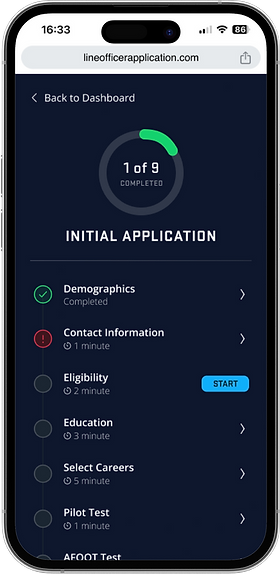
Applicants used to begin with stacks of forms and unclear instructions. Many stalled before even completing the first step.
We introduced a streamlined Registration & Login flow, followed by a guided Initial Application that clearly set expectations from the start.


Applicants entered the process with confidence, and recruiters received consistent, standardized data.
Timeline & Status — Making Progress Visible
Before, applicants felt like they were sending documents into a void. Recruiters were bombarded with calls and emails asking for updates.
We built the Timeline & Status UI — a simple, date-based tracker showing current stage, next step, and estimated wait times.


Applicants finally knew what was happening. Recruiters reported fewer interruptions and more time for meaningful conversations.
Dashboard & Summary — One Place for Everything
Applicants had no single view of their progress, and recruiters struggled to track incomplete or missing parts of applications.
We introduced a Dashboard and Application Summary where applicants could see progress at a glance, and recruiters could quickly identify bottlenecks.


The process became manageable instead of overwhelming. Applicants returned easily to incomplete steps; recruiters reduced manual tracking time.
Supporting Documents — Centralizing Complexity
Paper forms and scattered email attachments meant recruiters wasted time chasing missing files, while applicants felt unsure what was still required.
We centralized all key documents — AFCEP Forms, AFOQT, Letters of Recommendation, Waivers — into one clear submission system with status indicators.


No more missing paperwork. Applicants knew exactly what was pending, and recruiters no longer had to repeat requests.
RESULTS
Immediate Reactions, Real Validation
I tested early designs through internal walkthroughs and critiques. Recruiters responded positively to the timeline right away — it would reduce applicant questions and free up their time.
When the MVP launched, recruiters gathered applicant feedback. The response confirmed our instincts: applicants felt reassured by seeing where they were and what to expect.
“Applicants finally know where they stand.”
Impact
The results spoke for themselves:
-
35+ applications in the first week
-
Recruiters saved hours of manual work weekly
-
Applicants finally had real-time visibility into a complex process
The process was no longer a black box — it was a clear path.
The Power of 0–1 Design
If I had more time, I would have added richer interactions to the timeline and dashboard — animations, color coding, and more detailed statuses. I also would have included recruiter contact info for applicants with questions.
But even with constraints, the project confirmed what I love most: designing 0–1 products. Creating clarity out of complexity, and seeing the impact almost immediately.